When Jeremy and Julian from Symbio first came to us, they needed a new logo, a new website and wanted to generate qualified leads. We unfortunately came in second in the interview process and that was the end of that.
Best case study ever!
Just kidding. I followed up with them a few months later to see how things were progressing and we got lucky, the initial agency they retained wasn’t quite the perfect fit and we got our shot.
the need.
When Jeremy and Julian from Symbio first came to us, they needed a new logo, a new website and wanted to generate qualified leads. We unfortunately came in second in the interview process and that was the end of that.
Best case study ever!
Just kidding. I followed up with them a few months later to see how things were progressing and we got lucky, the initial agency they retained wasn’t quite the perfect fit and we got our shot.
Discovery
After our kickoff meeting and brand audit, we discovered a number of things that took our journey together in a new direction.
First off, they were so much more than an IT-as-a-Service company. The client profile they were running after wasn’t the types of clients they wanted to have going forward.
Out:Directors of IT
In:CEOs of impact organizations including B-Corps and Not-for-Profit Organizations
Secondly, why they were in business and how they operated it was more important than what they actually do.
They are in it for social impact first, profit a distant second.
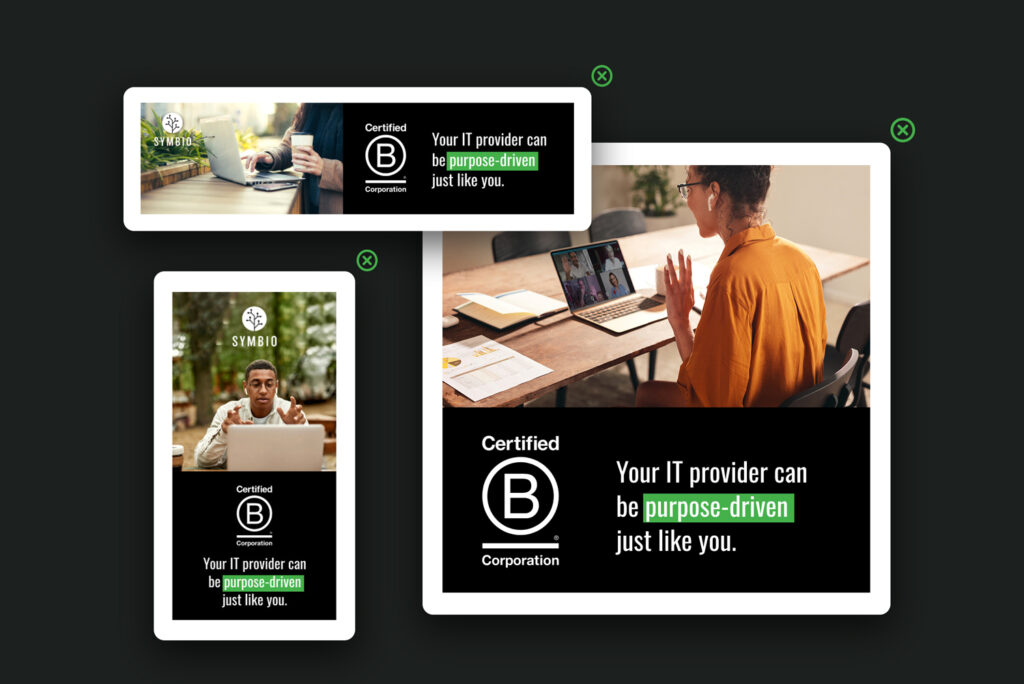
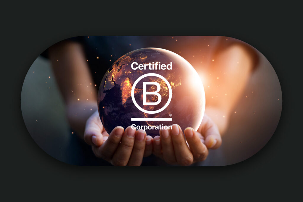
Their recent B-Corp accreditation was sweet validation for the deep care and intentionality with which they ran Symbio.
Messaging
Their desire for the rebrand was driven by a deep yearning for Symbio to externally communicate their values and their raison d’être. This had to start with not only what they were saying, but how they were saying it.
After several brainstorming and interview sessions, we crafted their key messages including their brand promise, brand attributes, brand values & voice and value proposition.
Out:Undifferentiated IT mumbo jumbo that you can find anywhere
In: Focusing on why they do what they do, the problems they solve and the impact the organizations they serve are having in their respective communities.
Hello new tagline: Great IT for the Greater Good
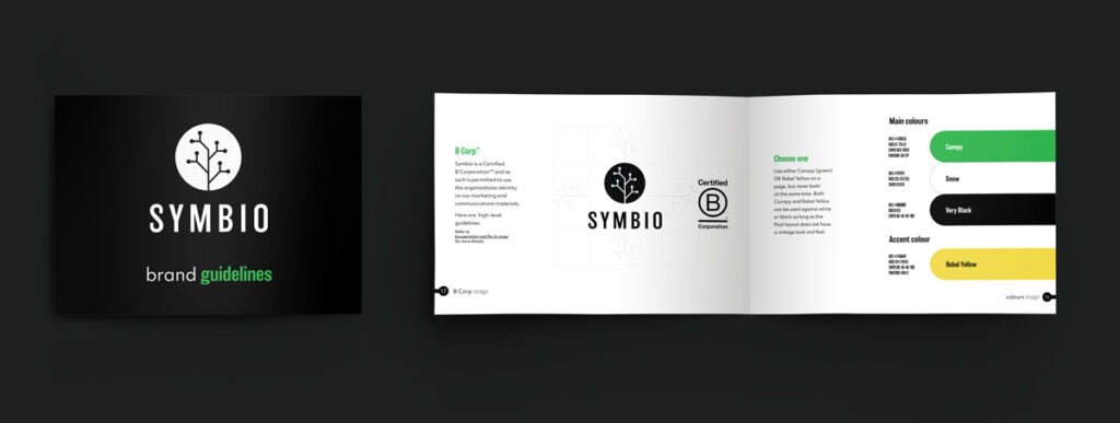
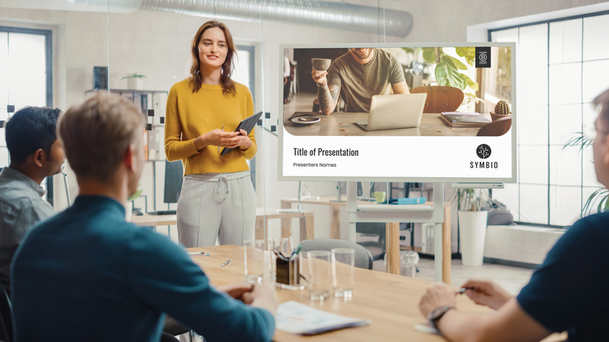
Visual Identity
Now it was time to bring this brand to life visually.
Symbio, like us all, is multifaceted. It is an IT company, a B-Corp, a shit disturber ( My word not theirs. They may have said rebellious, but let’s call a spade a spade. 😁)
After numerous iterations and various concepts, the IT Tree was born. It merged their work with their environmental sustainability initiatives. (Symbio offsets the IT carbon footprint of their clients with the planting of trees.)
Then, we build out their brand design system including colours, imagery, graphics, buttons, & textures. We capped this off with a complete set of brand guidelines and collateral such as letterhead, powerpoint templates, email signatures, etc.
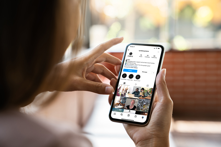
The boys were ready to venture out into the world with their new stylish threads.
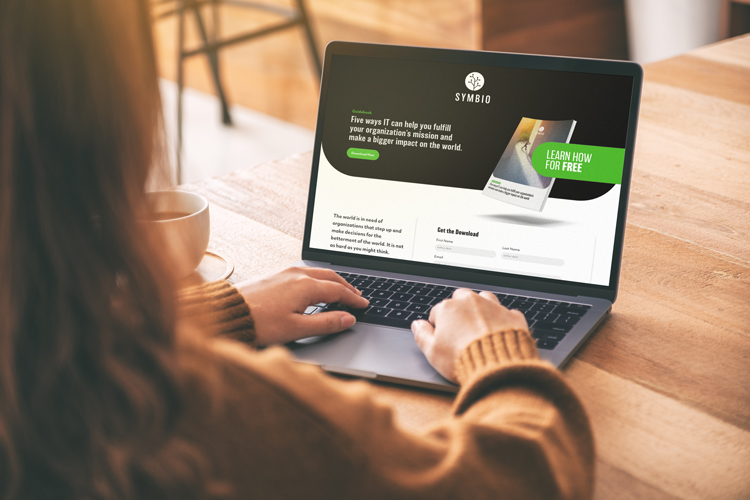
Website
This is where it all came together. Out for all the world to see.
The website held all the pressure on its shoulders to simultaneously create that great first impression, clearly communicate how they could amplify the impact of future clients with a rock solid IT backbone, and gently nurture any leads coming in from organizations who liked what they had to offer.
Clearly telling their story and that of their clients, providing a seamless user experience, and creating a snazzy lead generation machine, well that part fell on us. 😊💪 We were up for the task.